AI - Data Insight Generator
An AI-powered data analysis platform that connects to databases and data warehouses like BigQuery — letting users ask natural language questions and instantly receive insights, summaries, and auto-generated visualizations.
Plain English input
Matplotlib & Seaborn
Real-time data
OpenAI powered
01 / Project Overview
What We Built & Why
AI — Data Analysis is an intelligent analytics platform that bridges the gap between business users and raw data warehouses. Instead of writing SQL queries or waiting for BI reports, users simply ask questions in plain English — and the platform generates the query, executes it against BigQuery, and returns insights with auto-generated charts.
The platform eliminates the need for manual querying and report generation — reducing analysis turnaround from hours to seconds while making data exploration accessible to non-technical stakeholders.
Core problem solved: Business teams waste hours writing SQL, waiting for analysts, or navigating complex BI tools. This platform lets anyone ask "What is our monthly churn rate?" and receive an instant answer with a chart — powered by LLM + BigQuery + Python.
Natural Language
Ask complex questions in plain English — no SQL knowledge required.
Auto Visualizations
Charts and graphs auto-generated from query results — zero manual effort.
BigQuery Connected
Directly wired to data warehouses for live, real-time query execution.
AI Summaries
LLM generates concise, readable insight summaries from raw result data.
02 / How It Works
The AI Analysis Pipeline
Every query flows through an intelligent pipeline — from plain English input to SQL generation, live data execution, and auto-generated visual insights.
User types a question in plain English — e.g. "churn customers in December 2025" or "monthly total revenue".
The LLM converts the question into an optimised SQL query — schema-aware and tuned for BigQuery execution.
SQL executed against the live BigQuery data warehouse. Results fetched in real time — no stale cached data.
LLM reads the raw result data and generates a concise, readable business summary with key takeaways.
Matplotlib / Seaborn selects and renders the best chart type — bar, line, pie, or scatter based on data shape.
Results, summary, and chart rendered together in the UI. User can explore different queries in real time.
Users can refine or extend queries conversationally — "now break it down by region" builds on prior context.
Analysis complete — no manual querying, no BI tool configuration, no waiting for the data team.
02B / Live Application
See It in Action
Real screenshots from the deployed Data Insight Generator platform — from natural language query input to auto-generated SQL, query results, and interactive visualizations.
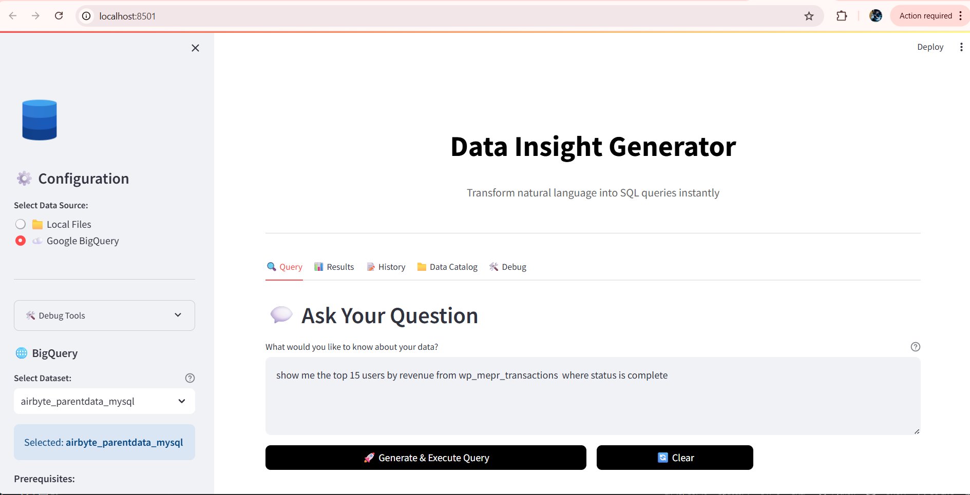
Step 01
Natural Language Query Input
Users simply type a question in plain English — e.g. "show me the top 15 users by revenue". The platform connects directly to Google BigQuery as the live data source.
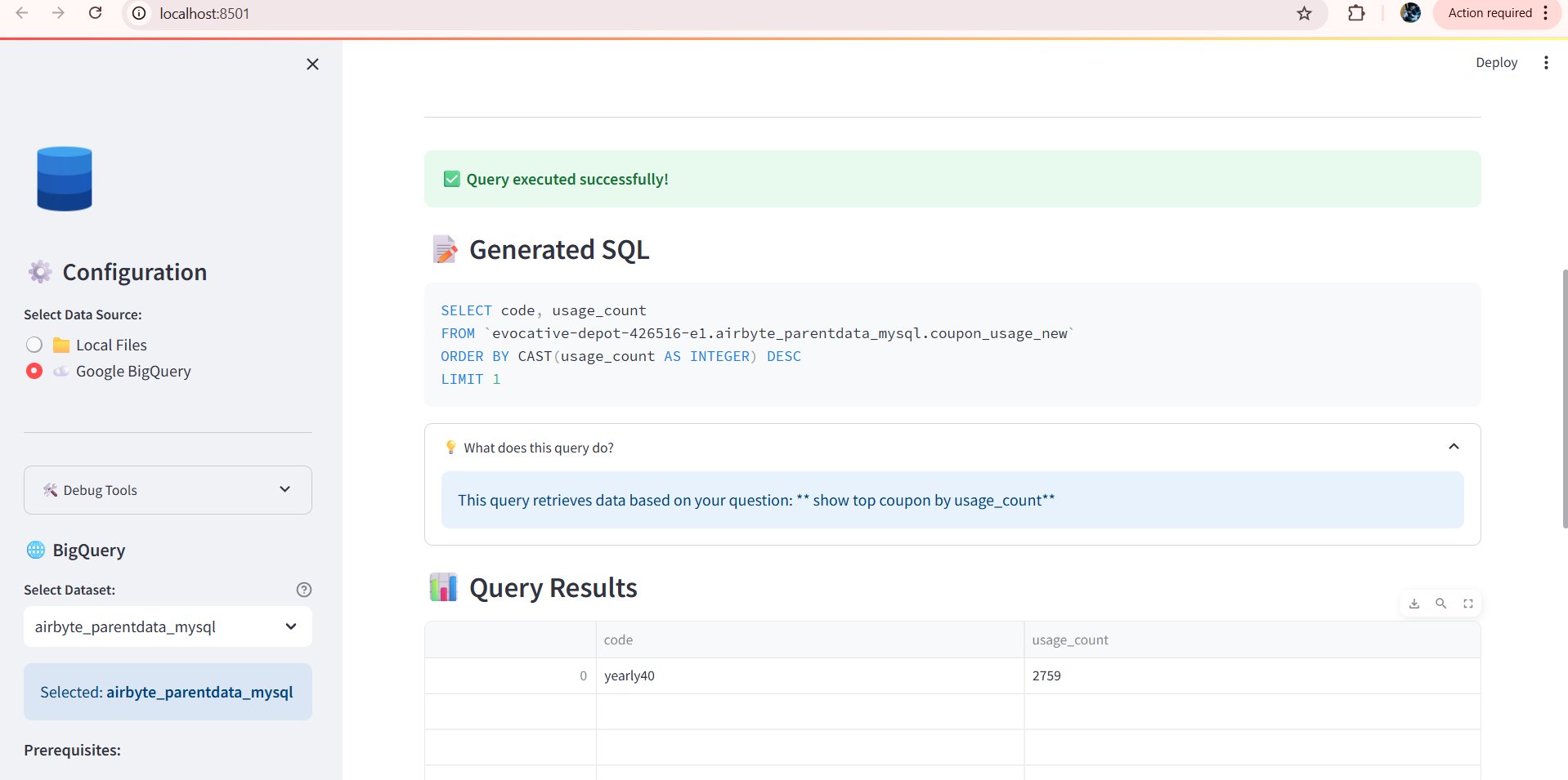
Step 02
LLM Generates SQL & Executes Query
The LLM converts the plain English query into optimised SQL with SELECT, ORDER BY, CAST, and LIMIT — executed against BigQuery in real time.
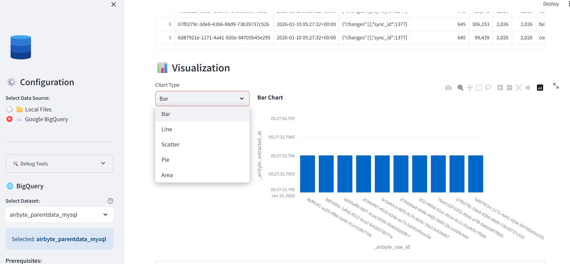
Step 03
Auto-Generated Bar Chart Visualization
After query execution, the platform automatically renders the most suitable chart. A Bar Chart visualises the result data — with a live chart type switcher to change views instantly.
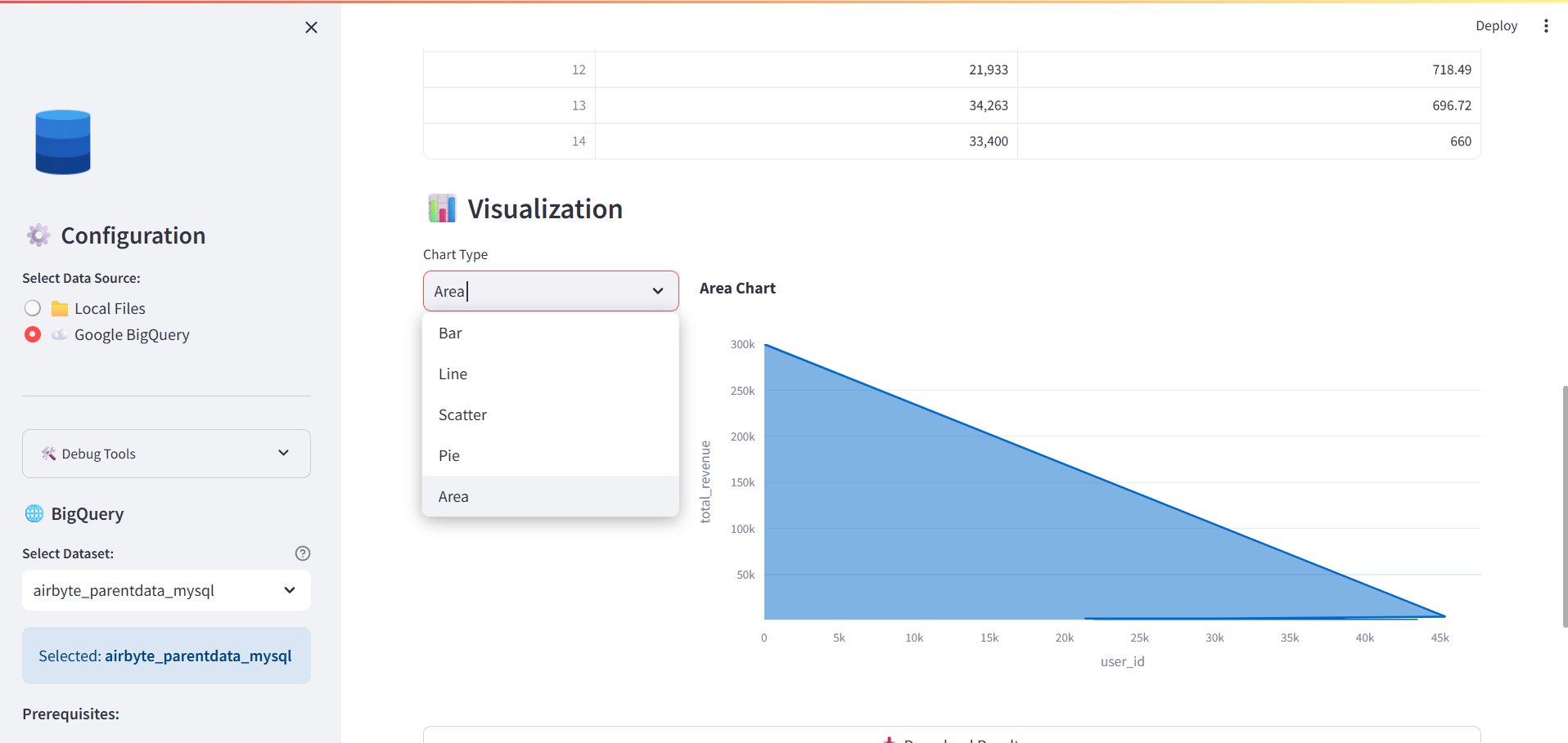
Step 04
Area Chart — Revenue Analysis
Switch to an Area Chart to visualise total_revenue across user_id — values up to 300K showing high-value customer concentration. Same data, different visual insight.
03 / Key Capabilities
What Users Can Ask & Get
"Churn customers in December 2025"
"Churn rate by month"
"Monthly total revenue"
LLM-Powered SQL Generation
BigQuery Integration
Query Optimisation
04 / Use Cases
Who Uses It & For What
Business Leaders
Ask "What was our Q4 revenue?" or "Which region had the highest churn?" — instant board-ready insights.
Growth & Marketing
Track campaign performance, user acquisition funnels, and conversion rates — no analyst needed.
Finance Teams
Monthly revenue reconciliation, cost analysis, and forecast comparisons in seconds instead of hours.
Product & Ops
Analyse user behaviour, feature adoption, and operational KPIs interactively — with auto-generated dashboards.
05 / Business Impact
What This Platform Delivers
Analysis time cut from hours to seconds — complex queries answered instantly without waiting for the data team.
Non-technical users can explore data independently — no SQL knowledge or BI tool training required.
Auto-generated charts eliminate manual reporting — every answer comes with a relevant, publication-ready visual.
Scales with your data — connected directly to BigQuery to handle millions of rows with optimised, cost-efficient queries.
Interactive reporting replaces static dashboards — users explore data dynamically and refine insights conversationally.
06 / Tech Stack
Technologies Used
07 / Skills & Deliverables
What Was Built & Applied
Want AI-powered data analysis for your business?
From natural language queries to auto-generated charts — we build intelligent analytics platforms that make your data work for everyone.