

Now, data plays a powerful role in shaping strategies, measuring performance, and identifying new opportunities. Every department—from marketing and sales to finance and operations—relies on data to make informed decisions. But having access to large amounts of raw data isn’t enough. To truly benefit from it, businesses need to transform that data into clear, meaningful insights.
That’s where data visualisation techniques become essential. They help simplify complex information by turning numbers into visual formats like charts, graphs, and dashboards. These visuals not only make data easier to understand, but also allow decision-makers to spot trends, identify gaps, and act quickly. Whether you’re presenting to stakeholders, reviewing internal metrics, or planning your next move, using the right visualisation can make all the difference.
What is Data Visualisation?
Data visualisation is the process of turning data into pictures like charts, graphs, and maps. These visuals help people see patterns, trends, and insights that might be hard to spot in a spreadsheet full of numbers.
For example, instead of just reading that sales increased by 20%, a line graph can show how the sales grew over time, making the message stronger.

Why is Data Visualisation Important?
These days, businesses deal with a lot of data every single day. But having data isn’t enough—it’s about understanding what it actually means. That’s where data visualisation helps. It turns complicated numbers into simple visuals, so you can quickly make sense of what’s going on and share your message more clearly with others.
Here are a few reasons why data visualisation really matters:
- Faster understanding: Charts and graphs make it easier to see what the data is saying without digging through rows of numbers.
- Better decision-making: When insights are clear, it’s easier to take action and make smart choices.
- Keeps people interested: Good visuals grab attention and help your audience stay focused on what you’re saying.
- Spots trends easily: You can quickly notice patterns or problems that might not be obvious in raw data.
- Makes complex things simple: Even big or detailed reports become easier to explain with the right visuals.
- Tells a clear story: Instead of just showing numbers, you can guide your audience through a story backed by real data.
Good visualisation isn’t just about making things look nice—it’s about making your message easy to understand and hard to ignore.
Simple Data Visualisation Techniques to Make Your Reports Stand Out
You don’t need to be a design expert to create great visuals. Here are some simple yet powerful techniques:
- Bar charts – Best for comparing different items or groups.
- Line graphs – Great for showing trends over time.
- Pie charts – Useful to show percentages or parts of a whole.
- Heatmaps – Show intensity or patterns using color (e.g., sales performance by region).
- Scatter plots – Good for showing relationships between two variables.
Keep your visuals clean and avoid clutter. Simpler is often better.
Why Data Visualisation Matters in Business
Imagine showing a long spreadsheet filled with numbers to your team. Chances are, they’ll lose interest quickly. But when you turn that same data into a clear chart or graph using the right data visualisation techniques, the story behind the numbers becomes obvious.
Good visualisation = better understanding = smarter decisions.
How to Choose the Right Data Visualisation Technique
Choosing the right technique depends on what you want to show. Different data visualisation techniques work better depending on the kind of information you are presenting. Ask yourself:
- What type of data do I have? (numbers, percentages, trends?)
- What’s the main message I want to share?
- Who is my audience? (Are they technical or not?)
Examples:
- Want to compare sales in different cities? Use a bar chart.
- Showing how sales increased over months? A line graph works well.
- Explaining how your revenue is split? Try a pie chart.
Always match your visual to the story you want to tell.
Free Tools to Try Different Data Visualisation Techniques
You don’t need expensive software to get started. Here are some free and beginner-friendly tools:
- Google Sheets – Has built-in charts and graphs, perfect for quick reports.
- Canva – Great for designing beautiful visuals, even if you’re not a designer.
- Tableau Public – Offers powerful visualisation options with a drag-and-drop interface.
- Datawrapper – Simple and clean tool for creating charts and maps.
- ChartBlocks – Lets you build charts and export them easily.
Try out a few and see which one fits your style best.
Avoid These Common Mistakes
Even if you have great data, poor visualisation can make it hard to understand—or even worse, lead people to the wrong conclusion. The goal of data visualisation techniques is to make things clear, not confusing. That’s why it’s important to choose the right chart type, keep things simple, and always be honest with how you present your information. A clean and clear visual is more powerful than one filled with unnecessary details or flashy colors. Always think about what your audience needs to see and understand, and design with that in mind. Focus on making your message easy to understand and avoid anything that distracts from the main point. Like!
- Using the wrong chart type
- Showing too much information
- Choosing poor color combinations
- Leaving out labels or titles
- Creating misleading visuals
Now let’s look at the techniques that work best for business insights.
1. Bar Charts – Great for Comparisons
Bar charts are one of the simplest and most used data visualisation tools. They help you compare different items or track changes over time.
Use bar charts when you want to:
- Compare sales performance across different regions
- Show revenue growth from month to month
- Highlight top-performing products
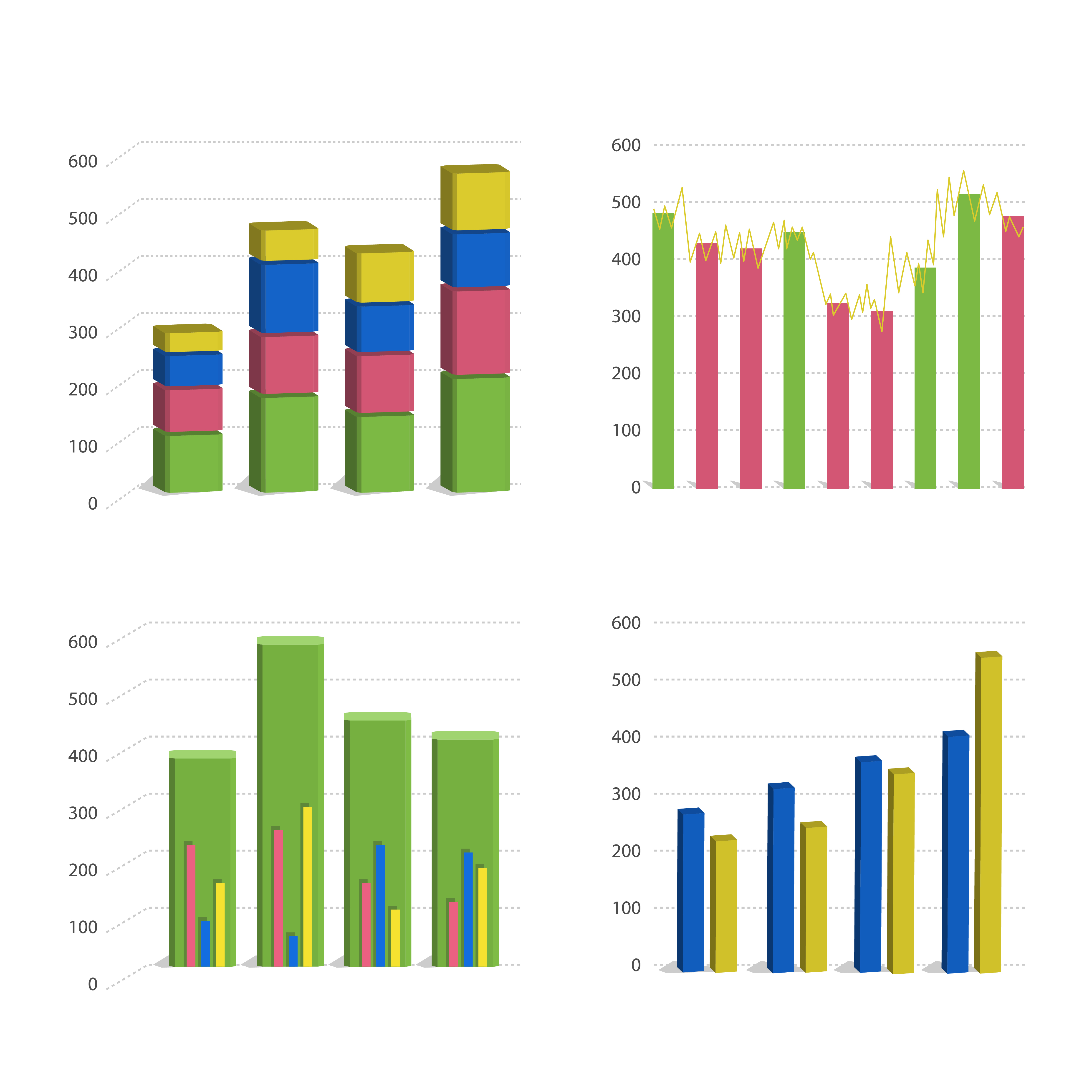
Tip: Use colors to make each bar easy to distinguish.
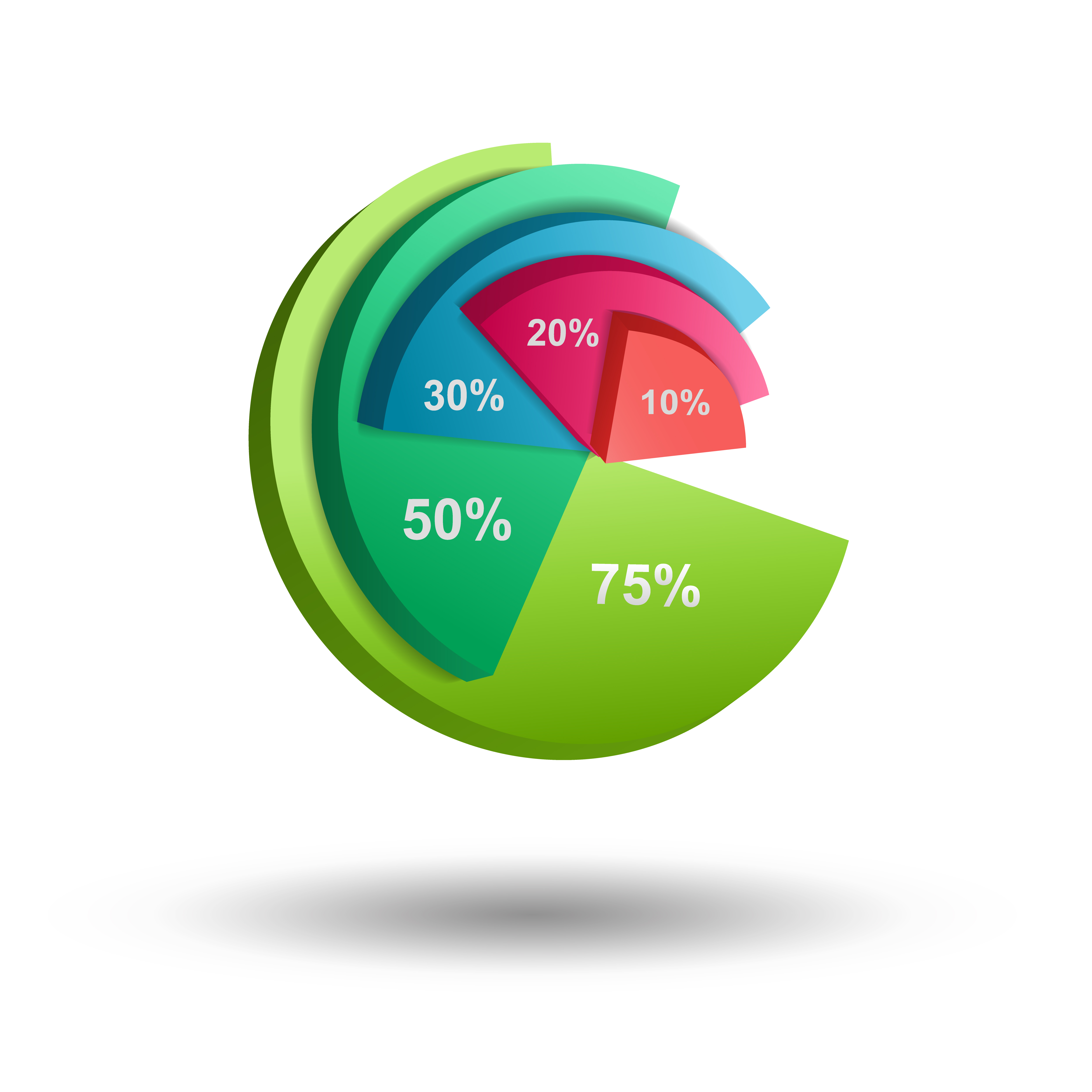
2. Pie Charts – Ideal for Showing Proportions
Pie charts are perfect when you want to show how something is divided into parts. For example, if you want to show what percentage of your total sales come from each product category, a pie chart works well.
Keep in mind: Only use pie charts when you have a small number of categories (less than 5). Too many slices can get confusing.
3. Line Graphs – Perfect for Trends Over Time
Line graphs are one of the best ways to show how something changes over time. Whether you’re tracking weekly sales, monthly website traffic, or customer growth, a line graph makes it easy to spot patterns and trends. Businesses often use line graphs to monitor important metrics like key performance indicators (KPIs), track the progress of different goals, and show how their customer base is growing. With a simple line moving across the graph, you can clearly see whether things are improving, staying steady, or need attention.
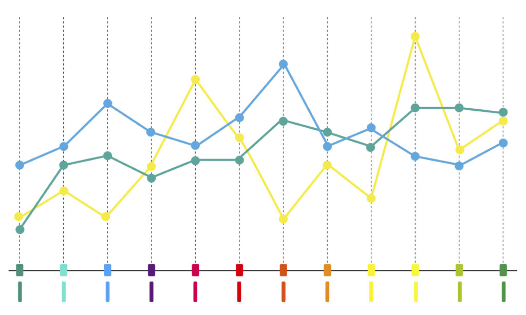
Bonus: You can add multiple lines to compare trends across different departments.
4. Heatmaps – Spot Patterns Quickly
Heatmaps are great for quickly spotting patterns, especially when you’re working with large amounts of data. They use color to show values—usually with darker or brighter shades highlighting areas that need attention. For example, businesses often use heatmaps to see which parts of a website get the most clicks or which regions have the highest sales. This makes it easier to focus on what’s working and where improvements are needed. With just a glance, a heatmap can show trends that might take a long time to find in a spreadsheet.

Tip: Stick to a simple color scale—green for high, red for low—to keep it easy on the eyes.
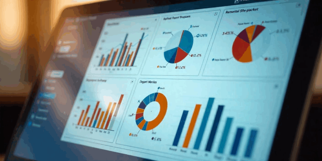
5. Dashboards – All-in-One View of Insights
A dashboard brings multiple charts and graphs together in one place. It’s perfect for giving management teams a real-time view of what’s going on in the business.
Use dashboards to:
- Track performance metrics
- Monitor real-time sales
- Keep different departments informed
Tools like Power BI, Tableau, or Google Data Studio make building dashboards easier than ever.
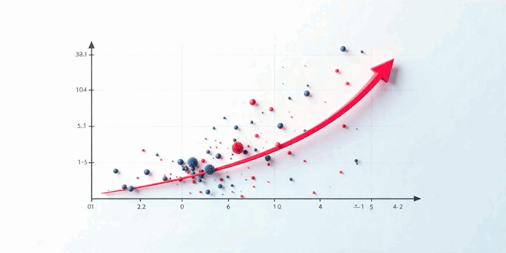
6. Scatter Plots – Understand Relationships Between Variables
Scatter plots are a great way to explore the relationship between two variables. For example, when trying to determine the impact of increased marketing spend on sales, a scatter plot can clearly show how the two are connected. By plotting data points on a graph, it becomes easier to identify patterns, trends, or correlations. Scatter plots also help uncover outliers—those data points that don’t align with the overall pattern—revealing potential issues or unexpected opportunities. This technique is especially useful for validating business assumptions and guiding strategic decisions based on real insights.
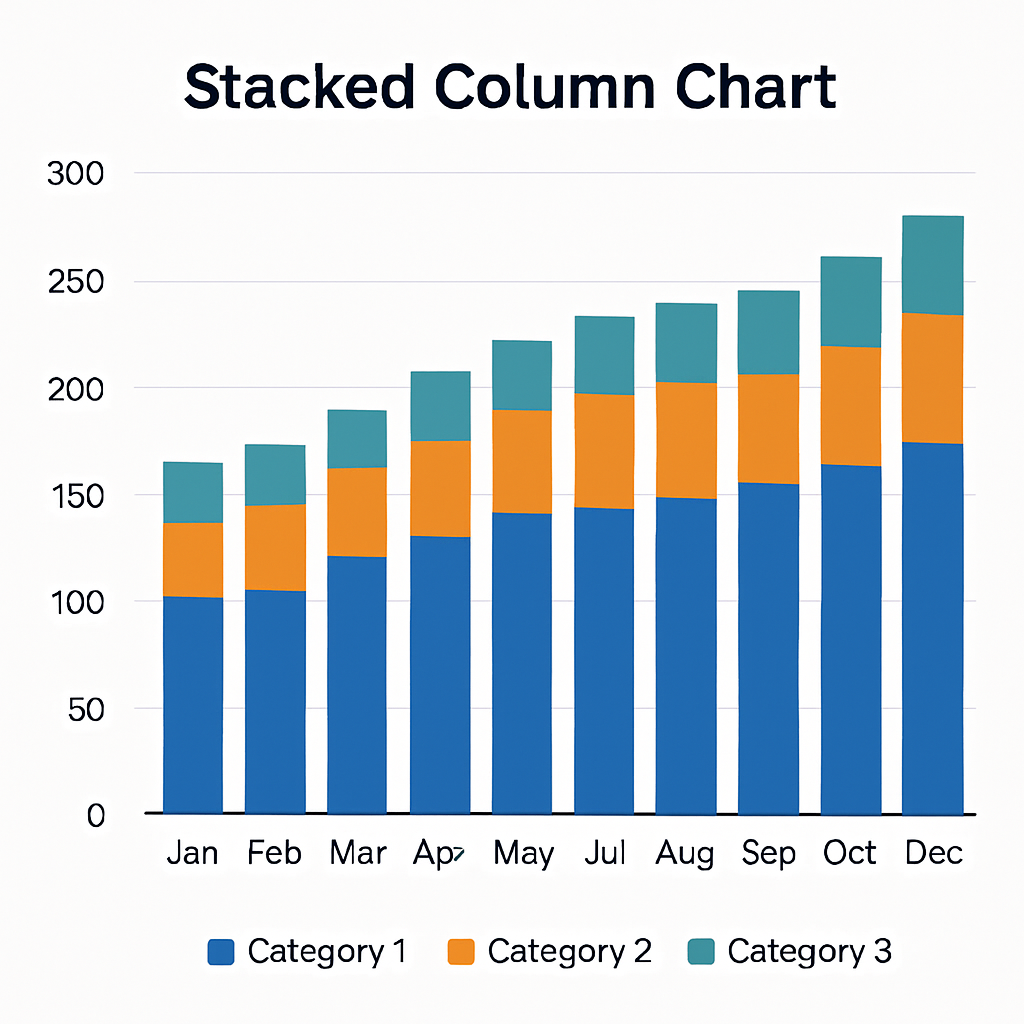
7. Stacked Column Charts – Show Part of a Whole Over Time
Stacked column charts are a great way to show how different parts add up to a total over time. Instead of looking at separate charts for each product, service, or customer segment, you can see everything in one view. Each colored section of the column represents a different part of the whole, making it easy to understand how each part contributes to the overall number. These charts are very helpful when you want to show total revenue broken down by category, understand what’s driving your business growth, or highlight multiple insights without overwhelming your audience. Stacked column charts also make it easier to spot trends, such as which product is gaining popularity or which segment needs more attention over a certain period.
They’re useful when you want to:
- Show total revenue broken down by category
- Understand what’s driving your growth
- Present multiple insights in one view
Conclusion
Data visualisation is one of the best ways to communicate business insights clearly. By using the right data visualisation techniques, choosing the right tool, and avoiding common mistakes, you can turn boring data into powerful stories that help your business grow. Start with simple charts and improve as you go—what matters most is making your message easy to understand.
As you get more confident, try different data visualisation techniques and visual styles to match your data and audience. The more clearly you present your insights, the more impact they’ll have.
Ready to bring your data to life? Start exploring these techniques today and make every report count!