
1. Introduction: The Shift Toward Intelligent Visuals
In the early days, visualizing data was all about static charts and simple graphs. Businesses relied on bar charts, pie diagrams, and line graphs created manually to make sense of information. As technology advanced, these visuals became more interactive. Dashboards and BI tools allowed users to filter data, explore trends, and generate reports with ease. However, these visualizations were still limited. They depended heavily on human input to identify what mattered most. Analysts had to decide which metrics to track, what charts to build, and how to interpret results. The visual tools could display data beautifully, but they could not think or understand the meaning behind it. Today, we are standing at the next evolution of visualization. It is no longer static or reactive. It is becoming intelligent, predictive, and context-aware, all thanks to artificial intelligence.
Why traditional dashboards are no longer enough
Traditional dashboards do a great job of summarizing information, but they fall short when data becomes complex or changes rapidly. A static dashboard can only show what has already happened. It does not tell you why it happened or what might happen next. In a world where decisions must be made quickly, simply visualizing data is not enough. Decision-makers need visuals that can interpret patterns, spot anomalies, and suggest next steps automatically. This is where AI adds a new layer of intelligence that turns plain visuals into actionable insights. AI-powered visualization tools can analyze massive datasets in seconds, find hidden trends that humans might miss, and even predict future outcomes. Instead of users searching for answers, the system brings those answers directly to them. This shift marks the beginning of truly smart visualization.
Table of Contents
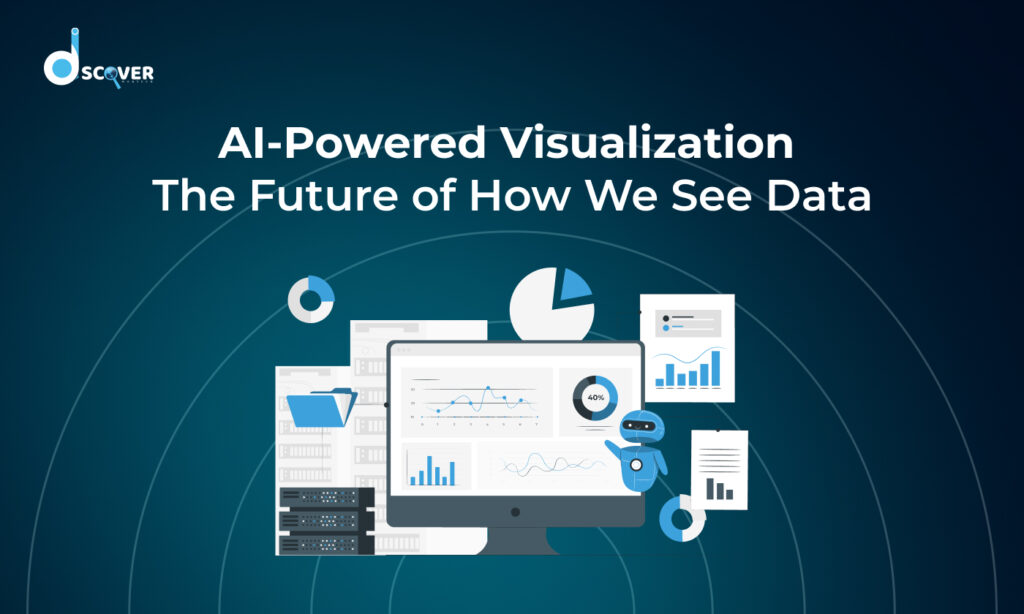
2. Understanding AI-Powered Visualization
Artificial intelligence is redefining how we see and interpret data. Unlike traditional visualization methods, AI adds intelligence to visuals, allowing them to not only display information but also analyze, interpret, and predict patterns. Understanding AI-powered visualization is key to grasping the future of data-driven decision-making.
AI-powered visuals can uncover hidden trends that may be missed by humans and highlight connections between data points that are not immediately obvious. They make complex datasets easier to understand and enable faster, smarter decision-making across industries. By combining automation with intelligence, AI transforms static numbers into dynamic, actionable insights that anyone can explore and act upon.
2.1 The role of artificial intelligence in shaping the next wave of data experiences
AI is no longer just a supporting technology; it is shaping how data is experienced and understood. It makes visuals smarter, more adaptive, and interactive. AI can detect patterns in large datasets, highlight important trends, and even suggest insights without manual intervention.
For businesses, this means moving beyond static reports and dashboards. AI-powered visualization allows teams to interact with data in a way that is predictive and context-aware. Marketing teams can quickly spot trends, healthcare professionals can detect anomalies in patient data, and researchers can uncover hidden insights. AI helps turn raw numbers into meaningful visuals that guide informed decisions.
2.2 What makes a visualization AI-powered
A visualization becomes AI-powered when it moves from static representation to intelligent interpretation. Unlike traditional charts, which require human input to determine what to show, AI-powered visuals learn from data and adapt in real time.
These visuals can automatically identify the most relevant metrics, detect anomalies, predict outcomes, and adjust the display based on context. They do not just show what happened; they help explain why it happened and what could happen next. This makes AI-powered visualization not only informative but also actionable and personalized.
2.3 Key technologies involved such as machine learning, NLP, and computer vision
Several key technologies form the backbone of AI-powered visualization. These technologies work together to make visuals smarter, more interactive, and capable of delivering deeper insights than traditional charts. They enable AI systems to understand complex data, detect patterns, and present information in ways that are easy to interpret and act upon. Machine learning, natural language processing, and computer vision not only automate the creation of visuals but also enhance their accuracy, relevance, and adaptability. They allow AI to learn from user interactions, adjust visualizations in real time, and provide personalized insights based on the specific needs of each user.
Machine Learning (ML): ML algorithms analyze historical data, identify patterns, and predict trends. In visualization, ML automatically detects correlations, classifies data, and highlights insights that might otherwise go unnoticed.
Natural Language Processing (NLP): NLP enables users to interact with data using natural language. Instead of complex queries, you can simply ask questions like “Which product had the highest sales last quarter?” and receive instant visual answers.
Computer Vision: Computer vision allows AI to interpret images, videos, and other visual inputs. It can analyze patterns, detect irregularities, and combine visual data with numeric datasets for deeper insights.
Together, these technologies make data exploration more intuitive, faster, and more intelligent, giving users a richer understanding of their information.
2.4 The difference between automated charts and intelligent visual systems
Automated charts generate visuals quickly but follow fixed rules. They can display data efficiently but cannot interpret or explain it.
Intelligent visual systems, however, go further. They analyze context, learn from patterns, and provide insights alongside the visuals. For instance, an automated chart might show a dip in sales, while an intelligent system identifies the cause, such as seasonal demand changes, and suggests actions to improve performance.
The main difference lies in insight. Automated charts visualize data. Intelligent systems explain, predict, and guide actions. This evolution marks a significant step toward smarter, more meaningful data experiences.
3. How AI Transforms Data Into Meaningful Visuals
Artificial intelligence does more than just create visually appealing charts. It transforms raw, complex datasets into meaningful insights that are easy to understand and act upon. By analyzing patterns, predicting trends, and adapting visuals to user needs, AI makes data not only accessible but also actionable. This transformation allows businesses, researchers, and decision-makers to focus on understanding the story behind the data rather than struggling to interpret it.
3.1 Automated pattern recognition and insight generation
One of the most powerful features of AI-powered visualization is automated pattern recognition. AI can quickly scan massive datasets and identify correlations, trends, or anomalies that might be overlooked by humans. For example, it can highlight sudden drops in sales, unusual customer behavior, or emerging market opportunities.
Beyond simply spotting patterns, AI can generate insights automatically. It can summarize findings, explain their significance, and even suggest actions to improve outcomes. This reduces the need for manual analysis and allows users to focus on strategy and decision-making rather than spending hours searching for answers in raw data.
3.2 Predictive visuals that reveal trends before they happen
Predictive analytics is a game-changer for visualization. AI uses historical data and machine learning models to forecast future trends. For instance, it can predict which products are likely to sell more in the next quarter, which regions may face a decline, or which customer segments are most likely to churn.
These predictive visuals allow businesses and organizations to stay ahead of the curve. Instead of reacting to past events, decision-makers can proactively plan strategies, allocate resources efficiently, and reduce risks. Visualizing predictions in a clear and interactive format makes it easier for teams to understand potential outcomes and take informed actions.
3.3 AI’s ability to adapt visual formats based on user preferences
AI-powered visualization is not one-size-fits-all. It can adapt the format, layout, and style of visuals based on user preferences, context, and the type of data being analyzed. For example, some users may prefer dashboards with graphs and charts, while others may benefit from heatmaps, timelines, or interactive storyboards.
This adaptability ensures that insights are presented in the most effective way for each user. AI learns from interactions and continuously improves visual recommendations. By delivering personalized, context-aware visuals, it helps users understand complex information quickly, make better decisions, and gain a deeper understanding of the data.
4. Smarter Storytelling: Turning Data Into Interactive Narratives
AI is changing the way we tell stories with data. Instead of just showing numbers or charts, it helps turn information into easy-to-understand, interactive stories. This makes it simple for users to explore data, find important insights, and make better decisions.
AI also helps connect different pieces of data together, showing relationships and patterns that are not immediately obvious. It can guide users through complex datasets step by step, making sure that important information is not missed. By turning raw data into a clear narrative, AI makes insights more engaging and actionable for everyone, regardless of their expertise level.
4.1 How AI personalizes storytelling based on audience context
AI can adjust the data story depending on who is viewing it. Different people need different insights. For example, a marketing manager may want to see customer behavior, while a finance manager may focus on revenue trends. AI understands these differences and shows the right information for each audience.
- Delivers visuals that are relevant to the user’s role and needs
- Highlights insights that matter most for each viewer
- Makes data easier to understand and act upon
4.2 Using natural language to explain visuals automatically
AI can explain charts and graphs in simple words. Users don’t have to spend time figuring out patterns or trends themselves. AI can summarize key points and highlight important findings automatically.
- Converts complex charts into simple explanations
- Provides instant insights in natural, easy-to-read language
- Helps non-experts understand data quickly
4.3 The growing role of generative AI in creating visuals and text together
Generative AI can create visuals and text at the same time. This allows reports, dashboards, or presentations to be generated automatically, with both charts and explanations included. It makes data storytelling faster, clearer, and more engaging.
- Produces both visuals and text in one step
- Makes presentations and reports more interactive and readable
- Helps teams communicate insights effectively to different audiences
AI-powered storytelling makes data more understandable and actionable. It moves visualization beyond static charts to interactive narratives that are tailored, explained in simple language, and easy for everyone to use.
5. Real-World Applications of AI-Driven Visual Insights
AI-powered visualization is no longer just a futuristic concept. It is actively being applied across industries to make data more actionable, understandable, and meaningful. By turning large, complex datasets into visual insights, AI allows organizations to make faster decisions, uncover hidden trends, and respond proactively to changes. From predicting outcomes to simplifying complex patterns, AI-driven visuals help both professionals and students interact with data in smarter ways.
5.1 Business analytics and intelligent dashboards
In the business world, AI is revolutionizing dashboards and analytics tools. Traditional dashboards simply display static charts or tables, requiring manual interpretation. AI-powered dashboards, however, can automatically analyze data, highlight key performance metrics, and detect unusual patterns that might otherwise go unnoticed.
For example, a sales team can instantly see which products are underperforming and why, while finance teams can monitor cash flow anomalies or unexpected expenses. These intelligent dashboards not only save time but also reduce human errors in data interpretation. By personalizing insights based on user roles and preferences, AI ensures that each department gets actionable information relevant to their goals.
5.2 Healthcare pattern detection and anomaly visualization
AI is having a profound impact on healthcare by helping professionals detect critical patterns and anomalies in patient data. Large volumes of medical records, imaging data, and lab results can be overwhelming for doctors and analysts. AI-powered visualization tools can highlight trends, identify unusual data points, and even suggest potential risks. For instance, an AI system can flag early signs of chronic disease progression or highlight patients at risk for complications. These visual insights make it easier for healthcare teams to make informed decisions, design personalized treatment plans, and improve patient outcomes. By converting complex medical data into clear, actionable visuals, AI supports faster and more accurate diagnoses.
5.3 Marketing campaign forecasting through visual prediction
In marketing, understanding customer behavior and predicting campaign performance is critical. AI-powered visualization tools allow marketers to forecast trends based on historical data, current engagement patterns, and predictive algorithms. AI can visualize which target segments are likely to respond positively to a campaign, or which products might see higher demand in the coming months. By combining predictive analytics with interactive visuals, marketers can plan campaigns more strategically, allocate budgets efficiently, and optimize messaging. AI also helps teams quickly detect anomalies, such as sudden drops in engagement, and take corrective actions. This ability to visualize predictions in an easy-to-understand format makes marketing efforts more proactive and results-driven.
5.4 Education and visual learning through data-driven materials
AI is transforming education by making learning interactive and visually engaging. Complex topics, datasets, or concepts that were once difficult to understand can now be represented with clear, dynamic visuals. Students can explore data through interactive charts, simulations, or dashboards, which encourages exploration and deeper comprehension. Teachers can also use AI-generated visualizations to explain complicated concepts in simpler terms, tailor lessons to different learning styles, and provide personalized feedback. AI can visually show trends in student performance or illustrate the impact of certain variables in a science experiment. By turning abstract data into concrete visual narratives, AI enhances understanding, improves retention, and makes learning more engaging for everyone.
7. Tools Leading the Revolution
AI-powered visualization is rapidly changing the way individuals and organizations work with data. The rise of advanced platforms has made it easier to convert complex datasets into interactive, actionable visuals. These tools are not just for large corporations, they are increasingly accessible to startups, small businesses, and educators looking to make sense of data quickly and effectively. Choosing the right tool and understanding its capabilities is key to leveraging AI-driven insights successfully.
7.1 Popular AI-powered visualization platforms in 2025
Several platforms have emerged as leaders in AI-powered visualization by 2025. Tools like Tableau augmented with AI capabilities, Microsoft Power BI with AI insights, and Google Looker provide intelligent dashboards, predictive analytics, and automated insight generation. Newer platforms like ThoughtSpot and Qlik Sense are designed with natural language queries, enabling users to ask questions in plain English and instantly receive visual responses. Other innovative platforms, such as DataRobot and Sisense, integrate machine learning and predictive modeling directly into dashboards, allowing teams to forecast trends and explore data dynamically.
These tools are not only visually appealing but also designed to make insights more actionable. They reduce the time spent manually analyzing data, help users uncover hidden patterns, and make it easier to communicate complex information across teams.
7.2 Key features to consider when choosing the right tool
Selecting the right AI-powered visualization platform requires careful evaluation to ensure it meets your organization’s goals and workflow needs. The ideal tool should not only display data but also provide actionable insights and predictive capabilities. Here are the key features to consider:
- Automated insights: The tool should be able to analyze datasets and highlight trends, anomalies, and patterns without manual intervention.
- Predictive analytics: Platforms with forecasting abilities help anticipate future trends, enabling proactive decision-making.
- Natural language processing (NLP): Tools that allow users to ask questions in plain language make it easier to interact with data and get instant visual answers.
- Interactive dashboards: The ability to explore, filter, and drill down into data provides a more engaging and insightful experience.
- Integration capabilities: The platform should seamlessly connect with existing databases, cloud services, and third-party applications.
- Customization and scalability: Look for flexible visualizations, adjustable layouts, and tools that can grow with your data and business needs.
- Collaboration features: Platforms that support team collaboration, sharing, and commenting make insights more actionable across departments.
- Real-time updates: For organizations relying on live data, tools that refresh visuals dynamically are essential for accurate decision-making.
By focusing on these features, organizations can select a platform that not only meets current needs but also supports growth, collaboration, and data-driven decision-making in the long term.
7.3 Affordable adoption strategies for startups and small businesses
AI-powered visualization tools are increasingly accessible, even for startups and small businesses. Many platforms offer tiered pricing, free trials, and cloud-based solutions that reduce upfront costs. Open-source tools and AI-powered plugins for existing spreadsheet software can also provide advanced visualization features at minimal expense.
Small businesses can start by focusing on critical datasets that provide the most immediate value, implementing AI insights gradually rather than attempting a full-scale adoption at once. Training team members on core features and leveraging built-in AI suggestions can help maximize the benefits of these tools without overwhelming resources. By strategically adopting AI-powered visualization, startups and small businesses can compete with larger organizations and make data-driven decisions efficiently.
8. Challenges and Limitations to Consider
While AI-powered visualization offers incredible potential, it is not without challenges. Organizations must be aware of limitations, ethical considerations, and the need for human oversight to ensure insights are accurate, unbiased, and actionable. Understanding these challenges helps businesses implement AI visualization responsibly and effectively.
8.1 Data privacy and ethical visualization concerns
AI-powered visualization relies heavily on data, including sensitive and personal information. Ensuring that this data is handled responsibly is critical to maintaining privacy and trust. Ethical visualization practices involve protecting personal information, anonymizing datasets when necessary, and avoiding misleading visual representations that could distort insights. Organizations must also comply with legal regulations such as GDPR, CCPA, and other data protection standards.
| Challenge | Explanation | Best Practices |
| Data privacy | Risk of exposing sensitive personal or organizational data | Use anonymization, encryption, and access controls |
| Misleading visualization | Incorrect or manipulated visuals may distort understanding | Ensure visualizations accurately represent data |
| Consent and compliance | Collecting and using data without permission | Follow GDPR, CCPA, and other relevant regulations |
| Data ownership and transparency | Confusion over who owns the data and how it is used | Clearly define data ownership policies and maintain transparency |
| Over-reliance on AI | Users may trust AI insights blindly without verification | Combine AI insights with human review and validation |
By addressing these challenges, organizations can maintain ethical standards, protect data privacy, and ensure that AI-powered visualization remains trustworthy and reliable.
8.2 Algorithmic bias in visual storytelling
AI algorithms learn from historical data, which can sometimes include biases. If not carefully monitored, these biases can be reflected in visual storytelling, leading to skewed insights or unfair conclusions. For example, an AI system trained on biased sales data may incorrectly prioritize certain regions or demographics, potentially impacting business decisions.
To mitigate algorithmic bias, it is essential to carefully select training datasets, test models for fairness, and continuously monitor AI outputs. Human oversight is crucial to validate the accuracy of insights and ensure that visualizations represent a fair and unbiased view of the data.
8.3 The need for human insight to balance automation
While AI can automate many aspects of data visualization, human expertise remains essential. Humans provide context, critical thinking, and domain knowledge that AI alone cannot replicate. For instance, AI can identify trends or anomalies, but interpreting why they occur or deciding how to act on them requires human judgment.
Balancing automation with human insight ensures that AI-powered visualization enhances decision-making rather than replacing it entirely. Collaboration between humans and machines leads to more accurate, actionable, and meaningful insights, maintaining the integrity and usefulness of data-driven storytelling.
9. The Future: Seeing Beyond Numbers
AI-powered visualization is only the beginning. The future of data storytelling will go beyond traditional charts and dashboards, offering immersive, interactive, and self-explanatory experiences. By combining AI with emerging technologies, organizations and individuals will be able to explore data in ways that were previously unimaginable.
9.1 Integration of AR, VR, and AI for immersive visuals
The combination of augmented reality (AR), virtual reality (VR), and AI is set to transform how we interact with data. Instead of viewing static charts on a screen, users will be able to immerse themselves in interactive 3D data environments. AI enhances these immersive experiences by providing real-time insights, predictive guidance, and adaptive interactions. For example, a supply chain manager could navigate through a visual representation of global operations, instantly spotting bottlenecks or trends, while students could explore historical or scientific datasets in virtual spaces for interactive learning.
The table below highlights key benefits and applications of AR/VR and AI integration:
| Technology | Applications | Benefits |
| AR + AI | Overlay data on real-world environments | Real-time insights, enhanced decision-making |
| VR + AI | Fully immersive 3D data exploration | Engaging learning, intuitive understanding of complex datasets |
| Predictive AI | Real-time trend analysis within AR/VR environments | Proactive insights, anomaly detection |
| Interactive dashboards | Navigate and manipulate data in virtual space | Better collaboration, faster problem-solving |
This integration makes data exploration more intuitive, immersive, and actionable, offering a richer experience than traditional 2D charts.
9.2 How generative AI will redefine data exploration
Generative AI will reshape data exploration by automatically creating visualizations, suggesting insights, and generating narratives based on underlying data patterns. Users will no longer need to manually create charts or interpret datasets; generative AI will propose the most meaningful visual representations. This makes data exploration faster, more creative, and accessible to non-experts, empowering organizations to extract insights from complex data more effectively and efficiently.
9.3 The vision of self-explanatory, intelligent data systems
The ultimate goal is to develop self-explanatory, intelligent data systems that present information, interpret it, and provide actionable insights with minimal human intervention. These systems will combine AI technologies such as predictive analytics, natural language processing, and interactive interfaces to make data understanding seamless.
Key features of these intelligent systems include:
- Automated insights: Highlighting trends, anomalies, and patterns without manual intervention
- Contextual explanations: Providing users with clear reasoning behind data patterns and predictions
- Actionable recommendations: Suggesting steps or strategies based on data analysis
- Adaptive interfaces: Adjusting visualizations and narratives based on user preferences and needs
Such systems will allow users to focus on strategy and decision-making rather than data processing, enabling smarter, faster, and more informed decisions.
10. Conclusion: A Smarter Way to See the World
AI-powered visualization is transforming the way we interact with data. It is no longer enough to simply display numbers in charts or tables. Today’s tools go beyond visualization. They analyze, predict, and tell stories that make complex information easier to understand and act upon. By combining AI, machine learning, natural language processing, and even immersive technologies like AR and VR, data has become more interactive, intelligent, and actionable than ever before.
As organizations across industries, from business and healthcare to marketing and education, embrace these tools, they are discovering new ways to make informed decisions faster and more confidently. Generative AI and intelligent systems are taking this a step further by creating self-explanatory visualizations that guide users through data, highlight patterns, and provide actionable recommendations.
The future of data visualization is about seeing beyond numbers. It is about turning raw information into meaningful insights, engaging stories, and interactive experiences. By leveraging AI-powered visualization responsibly, businesses and individuals can unlock hidden potential in their data, make smarter decisions, and gain a competitive advantage in an increasingly data-driven world.
In essence, AI-powered visualization is not just a tool. It is a smarter way to see the world, understand it, and act on it with clarity and confidence.
Check out our latest blog on – “How Shopify’s AI Store Builder Is Changing the Game for New Entrepreneurs”