At Discover WebTech, we believe that raw data alone doesn’t drive results—insightful action does. In today’s digital-first world, businesses generate endless streams of information, from customer interactions and campaign performance to financial transactions and product analytics. The challenge is converting this data into decisions—and that’s where our team members at Discover WebTech leverage the power of Business Intelligence (BI) through smart dashboards.
In this blog, we’ll explain what are dashboards in data analysis, explore the role of data visualization and dashboards, share insights on the best data visualization dashboards, and answer the question: which data set is best shown as a dashboard?
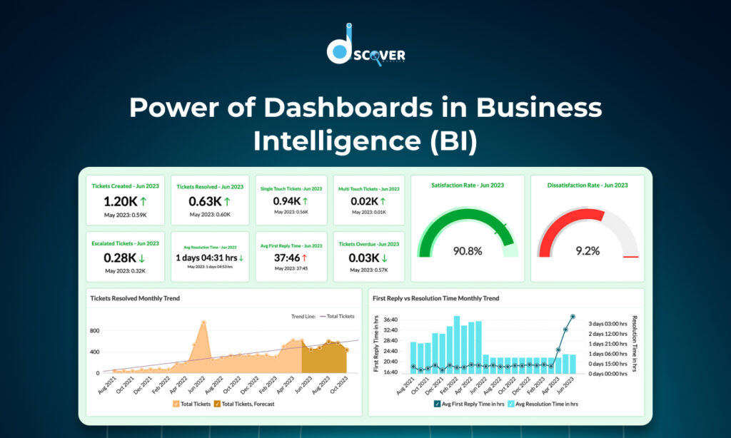
What Are Dashboards in Data Analysis?
As BI experts, we use dashboards daily to help clients visualize and interpret their data. So, what are dashboards in data analysis? Simply put, dashboards are interactive screens that bring key performance indicators (KPIs) to life. They showcase vital data through visuals like graphs, charts, and maps—all updated in real-time.
Whether it’s a strategic dashboard for leadership, an operational dashboard for monitoring workflows, or an analytical dashboard for deep dives, our team members design each one with purpose and clarity. For us, dashboards aren’t just reports—they’re the lens through which businesses see their truth.
The Role of Data Visualization and Dashboards in BI
At Discover WebTech, we don’t just build dashboards—we build data experiences. The combination of data visualization and dashboards helps businesses gain a crystal-clear view of their performance.
We’ve seen firsthand how the right visuals reveal trends, highlight anomalies, and tell compelling stories that raw tables never could. Through data visualization and dashboards, our team members empower clients to:
- Spot trends instantly
- Detect performance issues early
- Share insights across departments
- Make confident, data-backed decisions
From pie charts to heat maps, we tailor each dashboard element for clarity and actionability.
Benefits of Using Dashboards in BI
Our clients often come to us overwhelmed by spreadsheets. We help them shift from data chaos to insight clarity. Here’s how dashboards transform their operations:
- Real-Time Monitoring: Our dashboards update automatically, ensuring decisions are always based on the latest data.
- Data-Driven Culture: Everyone from the CEO to front-line employees can view performance KPIs in one place.
- Efficiency: We eliminate the need for manual reporting through automation.
- Custom Views: Whether you’re in sales or marketing, we build dashboards that speak your language.
- Performance Tracking: Our dashboards help teams measure what matters—fast.
Which Data Set Is Best Shown as a Dashboard?
We’re often asked: which data set is best shown as a dashboard? In our experience, great dashboards come from datasets that are:
- Continuously updated
- Actionable
- Easy to group, filter, and compare
- Visually compelling
Here are some datasets our team loves transforming into dashboards:
- Sales metrics: revenue trends, conversion rates, product performance
- Marketing data: campaign clicks, traffic sources, ROI
- Customer behavior: churn rates, lifecycle stage, feedback sentiment
- Website analytics: sessions, bounce rates, top landing pages
- Financials: budget vs. actuals, profitability by segment
So, to directly answer the question: which data set is best shown as a dashboard? It’s the kind that drives decisions when viewed in real-time and helps you act fast.
Best Data Visualization Dashboards (Examples & Tools)
Our team at Discover WebTech works across various industries, and we’ve tested many tools. Here are some of the best data visualization dashboards we recommend to clients:
Power BI
We love how customizable and cost-effective it is. With seamless Microsoft integration and great drill-downs, it’s a top pick for corporate environments.
Tableau
When clients want a visual masterpiece, Tableau delivers. It’s perfect for analytics teams that want rich interactivity and storytelling visuals.
Google Looker Studio
For startups and marketing teams, this free tool is ideal. We use it to build dashboards for SEO, PPC, and social media performance.
Looker (Google Cloud)
This one’s great for clients who need powerful, cloud-native dashboards driven by SQL modeling. Our team members love how scalable it is.
Every business has different needs, and our role is to match you with the best data visualization dashboards based on your use case and goals.
Best Practices for Building Effective BI Dashboards
When we build dashboards for our clients, we follow these principles to ensure maximum impact:
- Audience-first design: We ask—who will use the dashboard and what decisions do they make?
- Focus on KPIs: No fluff—only the most meaningful, relevant metrics.
- Visual simplicity: Clean, clear, and actionable. No clutter.
- Use the right visuals: Bar for comparisons, line for trends, pie for proportions, etc.
- Automated refresh: Your data shouldn’t sleep—neither should your dashboards.
- Mobile-responsive design: Dashboards should look great on every screen.
- Security and access control: Only the right eyes see the right data.
These best practices ensure our dashboards aren’t just attractive—they’re effective.
The Future of Dashboards in BI
At Discover WebTech, we’re not just building dashboards for today—we’re preparing for tomorrow.
Here’s what we’re excited about:
- AI-Powered Dashboards: Soon, dashboards will not just show data—they’ll explain it. Expect auto-insights, anomaly detection, and predictive alerts.
- Voice-enabled BI: Imagine asking your dashboard a question and getting spoken results.
- Personalized Views: Dashboards will adapt to users dynamically based on role, behavior, and preferences.
- Embedded Dashboards: Insights will be delivered right where you work—within CRMs, emails, or even Slack.
- Augmented Analytics: Our team is already experimenting with dashboards that recommend next steps, not just show metrics.
We believe the future of data visualization and dashboards is intelligent, interactive, and deeply integrated into decision-making workflows.
Conclusion
At Discover WebTech, we’ve seen how dashboards revolutionize the way businesses operate. They’re no longer just nice-to-have—they’re essential. A smart dashboard brings data to life, tells a story, and drives smart decisions.
We started this post by asking what are dashboards in data analysis—and now we hope you see how powerful they are when designed with purpose. From knowing which data set is best shown as a dashboard to selecting the best data visualization dashboards, our team is here to guide and support every step of your BI journey.
With the right dashboard, you don’t just view your data—you understand it.
Contact us to know more about our Data Visualization Services
Check out our latest blog on “The Role of SEO Monitoring in Long-Term SEO Success”