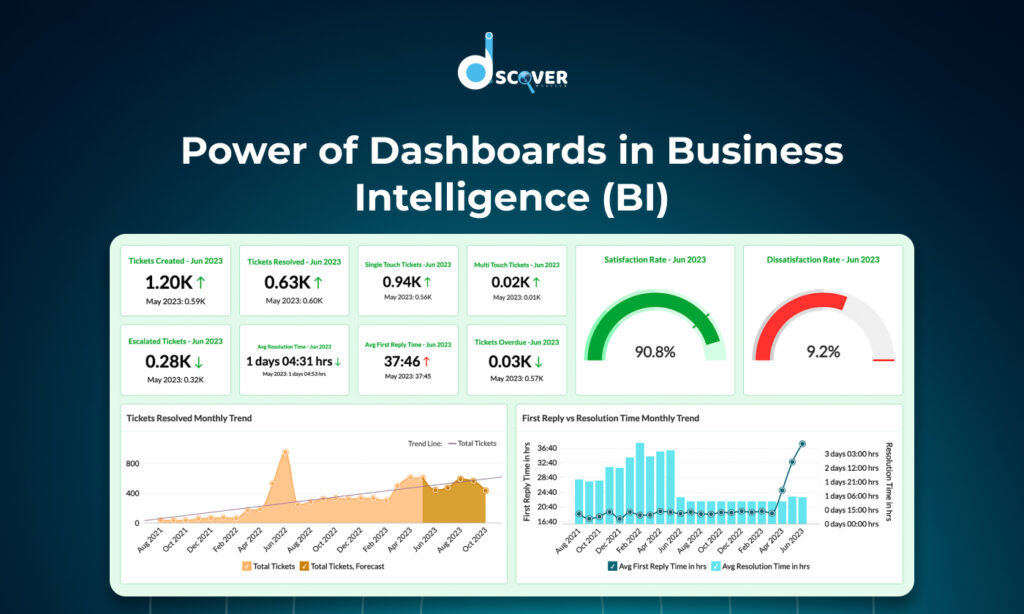
In a world driven by data, the ability to turn numbers into visuals is more powerful than ever. Whether you’re a student, aspiring analyst, or someone stepping into the tech world, learning data visualization tools is a fantastic way to present insights clearly and creatively.
But if you’re just getting started, the number of tools available can be overwhelming. Don’t worry—this blog will guide you through five of the best data visualization tools for beginners, each chosen for its ease of use, powerful features, and growing popularity.
Why Learn Data Visualization?
Before we jump into the tools, here’s a quick reason why data visualization matters:
- Faster understanding: Graphs are easier to understand than rows of numbers
- Better decisions: Decision-makers rely on visuals to catch trends and patterns quickly
- High demand: If you want to become a data visualization specialist, learning the right tools is the first step
Now, let’s explore the top five tools that beginners should absolutely try.
1. Microsoft Power BI
What is Power BI?
Power BI is a business analytics tool developed by Microsoft. It allows you to visualize your data and share insights across your organization or embed them in an app or website.
Why It’s Great for Beginners:
- Drag-and-drop interface with intuitive design
- Easy integration with Excel and other Microsoft products
- A huge library of visuals, filters, and interactive options
Use Case:
Create dashboards for sales, marketing campaigns, or operational data.
Cost:
Free version available with core features — a great choice if you’re looking for data visualization free tools
2. Tableau Public
What is Tableau?
Tableau is one of the most well-known data visualization platforms. The Tableau Public version is free and perfect for beginners.
Why It’s Great for Beginners:
- User-friendly interface
- Drag-and-drop functionality
- Amazing community and learning resources
Use Case:
Ideal for students and bloggers who want to publish visualizations online.
Cost:
Free (Public version), though your work will be visible to others
3. Google Data Studio (Now Looker Studio)
What is Google Data Studio?
Google Data Studio, now rebranded as Looker Studio, is a free tool that lets you turn your data into customizable dashboards and reports.
Why It’s Great for Beginners:
- 100% free with a Google account
- Connects easily with Google Sheets, Google Analytics, and BigQuery
- Templates available to get started quickly
Use Case:
Perfect for marketers and small business owners who want to visualize traffic, leads, and ad performance
Cost:
Free for all users
4. Canva Charts
What is Canva Charts?
Canva is mostly known for graphic design, but its Charts feature makes it easy to create sleek and modern visualizations—even if you’ve never coded before.
Why It’s Great for Beginners:
- Easy chart creation inside a drag-and-drop editor
- Stylish templates with built-in visual appeal
- No data science background required
Use Case:
Best for quick visuals for presentations, reports, and social media
Cost:
Free version includes chart tools; Pro unlocks more templates and assets
5. Flourish
What is Flourish?
Flourish is a tool designed for interactive storytelling. Journalists and marketers use it to embed beautiful, interactive charts on websites and blogs.
Why It’s Great for Beginners:
- Easy to use with ready-to-edit templates
- Interactive visuals like animated bar charts, maps, and more
- No programming skills required
Use Case:
Excellent for storytelling with interactive visualizations on websites or media blogs
Cost:
Free plan available with public projects
Bonus: What Not to Do — Bad Examples of Data Visualization
As a beginner, it’s just as important to know what not to do. Let’s look at some data visualization bad examples:
- Overuse of 3D charts that confuse the viewer
- Using pie charts for complex comparisons
- Poor color contrast making data hard to read
- Labeling issues or missing axes
Avoiding these common mistakes will set you apart as a thoughtful and strategic visualizer—even early in your journey.
Tips to Get Started as a Data Visualization Specialist
Here’s how you can build your skills and grow into a confident data visualization specialist:
- Start simple: Use tools like Google Sheets or Canva to get the hang of visual layout
- Practice storytelling: Don’t just show data—tell a story with it
- Explore real datasets: Use free datasets from Kaggle, Google, or government sites
- Share your work: Publish your dashboards or visuals on social media or a blog
- Learn continuously: Follow YouTube tutorials, enroll in free courses, or join data communities
Final Thoughts
Starting with the right tools makes a world of difference when you’re learning data visualization. The five platforms we discussed—Power BI, Tableau Public, Google Data Studio, Canva Charts, and Flourish—are all perfect gateways into the field.
Whether you want to visualize marketing data, tell stories through interactive visuals, or become a skilled data visualization specialist, these tools will help you take your first confident steps. And the best part? Most of them are data visualization free tools, making them accessible to anyone with curiosity and a willingness to learn.
Checkout our new blog on – “Node.js vs Express.js: A Simple Guide to Understanding Backend Frameworks”
Contact us to know more about oure services.


